The last big housing slump was in the mid-1990s. Everyone took a hit, but how bad was it in MB?
Data from Dataquick, compiled by MBC, paint the picture.
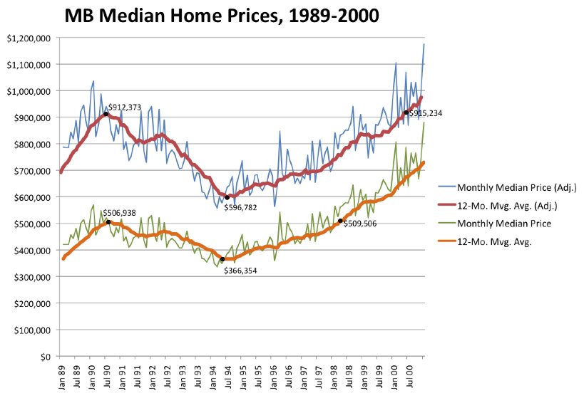
Our graph here (click to enlarge further) shows the change in median home prices in Manhattan Beach throughout the 1990s. The two separate series here come from the…
The last big housing slump was in the mid-1990s. Everyone took a hit, but how bad was it in MB?
Data from Dataquick, compiled by MBC, paint the picture.
Our graph here
(click to enlarge further) shows
the change in median home prices in Manhattan Beach throughout the 1990s. The two separate series here come from the same data, although one series (the top two lines, in blue and red) is adjusted for inflation, showing values in 2007 dollars. The bottom series (green and orange) uses the values reported from each year without any adjustment.
Let's start with that bottom series, since adjusted figures can be confusing. Here, the green, bouncy line shows the median price of all homes (SFRs, THs and condos) sold in a given month. The orange line shows the 12-month moving average – the average of that month plus the 11 months before it. The moving average smooths out seasonal factors and limits the problem of small samples sizes month-by-month. (The data start in 1988, but we start the graph in 1989 to allow that 11-month look back in time.)
You'll see that median prices were on an upward trend by 1989, peaking early in the chart at
$506,938 in July 1990.
(All dollar figures we cite here come from the 12-month averages.) Then a slower, steady reversal took hold. Four years later, in July 1994, a trough was reached at
$366,354. This was slightly below the January 1989 figure.
The drop, peak-to-trough:
27.7%.
The recovery to July 1990 levels took almost 4 more years. The chart notes that a value of
$509,506 was reached in March 1998 – 44 months after the trough. That means the pause between the peak and the return to peak was
7 years, 9 months.
Now, anyone knows that the value of a dollar – or 500,000 of them – changes quite a bit over 8 years. So the return to "peak" values in March 1998 is a bit misleading. On paper, it was the same median price, but the real value wasn't the same.
To see how steep the real decline was, and how long the recovery really took, we look again at the data in constant dollars – in this case, using 2007 dollars across the board. (We had a choice here of constant dollars tied to 2000 – the last year in the chart – or 2007,
i.e., current dollars. We chose 2007, partly because future graphs in this series will also use 2007 dollars.)
Using 2007 dollars affords us an interesting view of MB home values. When we adjust all the values in the chart, we learn that homes at the median were worth
$912,373 in today's dollars at the peak in July 1990. That's almost double the $500k or so we saw in nominal dollars.
Perhaps more interestingly, this chart is implying that you ought to be able to buy a median-priced home today in MB for about $900k – the peak price of 18 years ago. Of course, you can't. Prices have gone far higher than a mere inflation adjustment would account for.
The timing of the
drop in values in the early 1990s coincides with that found in the first chart – the drop ran till July 1994, down to
$596,782. (Anyone for a $600k MB house?)
The drop, peak-to-trough, in constant dollars:
34.6%.The
recovery of values in real-dollar terms took much longer. It was 70 months (5 yrs., 10 mos.) from the trough until the previous peak value was reached again in May 2000. The total gap between the peak in July 1990 and the return to peak in May 2000 was
9 years, 11 months. That means, in simplest terms, if you bought at the peak, you had to hold the home for nearly 10 years to be able to sell it again for the same real value.
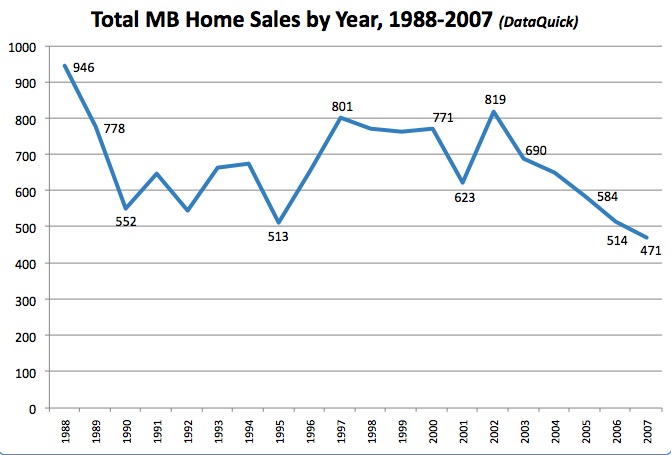
We're also re-publishing our first graph from the DataQuick series here, partly to note that sales totals in MB consistently exceeded 500 per year even in the slumpiest year (1995), while running at a rate near 800 per year for almost 4 years before that real-dollar peak was re-attained in the year 2000.
Those sales figures suggest that, while lower demand briefly followed the price trough, substantially higher demand kicked right back in. And yet, over several years, more sales still did not correspond to much higher prices.
As we've previously noted, the sales pace of 2006 was consistent with cruddy 1995 while 2007 sank below that to a new sub-500 low. The pace in 2008 is even slower. We'll look at the runup of the 2000s shortly and ask when the slower sales pace might begin to affect prices in a significant way. The curious lesson from this 1990s experience is that when the sales pace picks up again some day in MB, higher prices are by no means guaranteed to follow.
––––––––––––––––––
UPDATE: The story originally said that the price recovery from the mid-90s low was reached in March 2000. It was May 2000, as the current version shows.
––––––––––––––––––
Nerdy NotesImportant caveat: The charts are imprecise in one respect – we are using monthly median prices for all of this analysis. Even the 12-month moving average represents a smoothed average of 12 monthly median prices, which is not the same as the "true" median for that particular 12-month period. The "true" median could only be calculated month-by-month by DataQuick using the actual sales records for 243 months that went into this dataset. We believe this representation is accurate and certainly illustrative, but it necessarily falls short of that ultimate precision.
Sources: The figures presented here come from a dataset produced by DataQuick Information Systems. Data for sales of one-family homes (including SFRs, THs and condos) in Manhattan Beach were purchased by an MBC reader and forwarded to us.
(Thanks!) We have permission to create and publish charts and analyses using the data, but we cannot provide substantial amounts of the source material, per the agreement with DataQuick. (In other words, they want to keep the raw data private.)
Adjustments for inflation were made using data published by the U.S. Dept. of Commerce, Bureau of Economic Analysis. We used the bureau's implicit price deflator figures for residential investment, the figure most appropriate to home prices. These figures are published for each quarter of each year; therefore, each quarter's worth of median price data has been adjusted separately, rather than using an annual figure for each year's data. Quarter 4 of 2007 is the base figure used for all the adjustments – not only are we using constant 2007 dollars, but Q4 '07 dollars.
Please see our blog disclaimer.
Listings presented above are supplied via the MLS and are brokered by a variety of agents and firms, not Dave Fratello or Edge Real Estate Agency, unless so stated with the listing. Images and links to properties above lead to a full MLS display of information, including home details, lot size, all photos, and listing broker and agent information and contact information.